For the fourth-straight season, the NBA and Nike collaborated on 'City' edition jerseys for every team in the league. Since Nike took over as the official uniform partner for the league, some teams have really gotten creative with uniform designs, while others have simply taken the easy route. The 'City' edition uniform is intended to reflect the community that each team resides in.
In years past, some franchises have knocked it out of the park, like when the Minnesota Timberwolves pulled out a Prince tribute with their purple rain jersey, or the Miami Heat introducing the most popular NBA jersey in recent memory with their Vice uniforms. The league officially unveiled all 30 jerseys Thursday morning, though many teams already rolled them out on social media. Like previous iterations, the 'City' edition uniforms will be worn throughout the 2020-21 season, and the league also announced that some of them will be worn during the slate of Christmas Day games.
This year's crop of city edition jerseys offered some unique options, as well as new twists on old classics. So, let's rank all 30 jerseys and see which one stands out above the rest this year.
30. Washington Wizards
Pretty on the nose for the Wizards to -- again -- go with the stars and stripes, red, white and blue design. Washington opted to just change the main color from last season's 'City' edition uniforms from white to grey. But with John Wall just being traded for Russell Westbrook, the Wizards probably have a bit more on their minds than what I think of their jersey designs.
The new #Wizards City Edition jerseys have been unveiled on their team store. https://t.co/DhkZKzVke5 pic.twitter.com/iL4zHLSbM2
— Jake Russell (@_JakeRussell) December 3, 2020
29. Boston Celtics
Yeah, no these are incredibly boring. I get the idea to use a championship banner as inspiration, but this isn't it. There's nothing unique that stands out about it. It also does nothing to speak to the city of Boston.
From the rafters to the parquet, it’s all about #TheBanner. pic.twitter.com/YVwvba5U1j
— Boston Celtics (@celtics) November 20, 2020
28. New Orleans Pelicans
The Pelicans copy and pasted the New Orleans flag onto a jersey...groundbreaking.
Passionate. Resilient. Unparalleled.
— New Orleans Pelicans (@PelicansNBA) November 13, 2020
There's only one New Orleans. ⚜#WontBowDown pic.twitter.com/WzigGHRVvd
27. New York Knicks
The Knicks partnered with New York-based streetwear brand KITH to create these, and they're a total dud. For a team in the league's biggest market, and a city as diverse and historic as New York City, you'd think the Knicks could muster something a bit more creative.
Le maillot City Edition des Knicks pour la saison NBA 2020-21 ! 🔥 pic.twitter.com/BoRfQY8eqK
— TrashTalk (@TrashTalk_fr) December 3, 2020
26. Detroit Pistons
Upsetting that for a place with as cool a nickname as "motor city," this was the best they could do. The design is simplistic and clean, but it's also incredibly dull.
Our city. Motor City. pic.twitter.com/pSkKQQ26KB
— Detroit Pistons (@DetroitPistons) November 20, 2020
25. Miami Heat
The Heat created perhaps the most iconic city edition uniform years ago with its first iteration of the vice jersey. In black with pink and blue accents, it was the best jersey out there. Then, Miami kept going back to the well and just did different color versions of the Vice uniforms. This year, though, the Heat turned an iconic jersey into a mess. Two-tone gradient is not a good look, regardless of how cool the initial idea is.
VICE in its final format ⏩ #ViceVersahttps://t.co/EubRBsLEGK
— Miami HEAT (@MiamiHEAT) December 1, 2020
@MiamiHEAT // @AmericanAir pic.twitter.com/t7X2XpUU8z
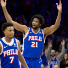
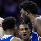
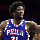
24. Philadelphia 76ers
I get the intention with this jersey, it's supposed to represent Philadelphia at night with the lights of Boathouse Row shining on. The thing is, though, the execution isn't all that great. That coupled with the placement of the numbering and "Philadelphia" cluttering up the image of the houses, this is a tad bit messy.
The threads. 🧵 pic.twitter.com/mDf4Mvk2V3
— Philadelphia 76ers (@sixers) November 10, 2020
23. Los Angeles Clippers
The Clippers inverted their 2019 version of the city edition uniform and made it black. It looks sleeker than the white version, but the overall design is nothing special.
Running it back in black. pic.twitter.com/tFDhLH82i1
— LA Clippers (@LAClippers) December 1, 2020
22. Oklahoma City Thunder
Other than the "Oklahoma" across the chest, I'm not sure what this really says about the city or state. The city edition jersey that the Thunder released a couple of years ago that paid homage to the native tribes in Oklahoma was a far better representation than this.
Pride and passion for our state.
— OKC THUNDER (@okcthunder) November 16, 2020
On Statehood Day, 2020 we introduce this season’s City Edition. https://t.co/MTnhmwCROq pic.twitter.com/kYPlP3ku5q
21. Orlando Magic
There has got to be something more inspiring about the city of Orlando than oranges. I didn't think it was possible to make pinstripes look bad, but something about the orange and the white doesn't pop out. If this jersey was black with orange pinstripes, then it would look amazing, but as it stands, it's just average.
The moment you've been waiting for... #cityedition 🍊 pic.twitter.com/AO7FCNFVfk
— Orlando Magic (@OrlandoMagic) November 10, 2020
20. Sacramento Kings
The Kings combined elements from past uniforms to create this 2020-21 iteration, and it's a clean look. It's a nod to the days that the Kings were based in Kansas City with the baby blue and red accents, but it doesn't speak to the city of Sacramento at all.
New Sacramento Kings Uniforms Created with History Behind Every Stitch » https://t.co/Lzf5EpIRUz pic.twitter.com/sQFZoycEIA
— Sacramento Kings (@SacramentoKings) November 9, 2020
19. Dallas Mavericks
The gold is a nod to the 40th anniversary of the Mavericks franchise, while the wings on the trim of the jersey and shorts are, per Dallas' press release, "a nod to the legend of the pegasus." For those scratching their heads, there's a giant neon-lit pegasus statue located in downtown Dallas. If that was the goal, then there were far better ways to incorporate the pegasus. However, this is a significant step up from the awful uniforms Dallas wore last year.
A departure from our traditional blue and a signal that a bright future is on the horizon ✨ @chime | #MFFL pic.twitter.com/Y3dfRK8Vvw
— Dallas Mavericks (@dallasmavs) November 24, 2020
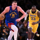
18. Los Angeles Lakers
The reigning champions went back in time to pull out the baby blue uniforms, but this time in white. It's a break away from the previous city uniforms that have honored Lakers legends in the past like Kobe Bryant and Shaquille O'Neal, and while it's a clean look overall, nothing about it stands out from the traditional purple and gold the Lakers wear every other night.
LEGACY OF LAKER LORE
— NBA Store (@NBASTORE) December 3, 2020
Get your @Lakers Nike NBA City Edition Jersey NOW ➡️ https://t.co/wNDEuOpuS1
🗓️ NBA Season Starts Christmas Week with Games Beginning Tuesday, December 22. pic.twitter.com/Cabyf6Cjzh
17. Portland Trail Blazers
Kudos to the Trail Blazers for trying something a little different. For the first time ever the Blazers printed "Oregon" across the chest of their jerseys, and it just so happens to be in the same font that is used on the iconic Portland, Oregon sign in downtown Portland. The trimming on the side of the jerseys is a nod to the landscape of Portland's picturesque mountain ranges, and the color scheme honors the tribal nations throughout the state. It's a nice break from the traditional black, red and white uniforms that the Blazers have donned every year.
Our 2020-21 uniform celebrates the unique beauty of Oregon’s landscape as well as acknowledging & honoring the tribal nations throughout what is now considered Oregon who have called this land their home from the beginning.
— Portland Trail Blazers (@trailblazers) October 29, 2020
Take a closer look: https://t.co/rDbfOWf2In pic.twitter.com/j7fKjOGA3w
16. Chicago Bulls
The Bulls really played into the beautiful architecture that spans across Chicago, from the art deco font choice to the geometric diamond pattern used on the trimming of the shorts and jersey. It's a very modern design, the only gripe I have is the shade of the gold used, if it were just a tad brighter, it would stand out a bit more on this jersey.
It’s all in the details 🔥 pic.twitter.com/nULf1sEDEe
— Chicago Bulls (@chicagobulls) November 13, 2020
15. Houston Rockets
Clean, simple, eye-popping colors: this is a nice looking jersey. It's a revised version of last year's 'City' jersey, so no points for creativity, but it looks far better in baby blue.
City Threads 🔥💯 pic.twitter.com/kwEr9DwlIh
— Houston Rockets (@HoustonRockets) December 3, 2020
14. Denver Nuggets
The Nuggets took their fresh spin on the retro rainbow skyline jersey and flipped it to red. They've already worn black versions of this jersey, which also look great, but these are being marketed as "Denver Sunset," and instead of the rainbow stripes across the middle everything is in the same red color palette. These may look better on the court than they do in images, but it might be time for Denver to try a different design after this year for the 'City' edition.
360 degrees of fresh.#RainbowSZN #MileHighBasketball pic.twitter.com/8kUIjtam4T
— Denver Nuggets (@nuggets) November 19, 2020
13. Utah Jazz
Similar to Denver, Utah took its tried-and-true city jersey and gave it a little tweak. The Jazz benefit from not having a jersey in black before this, though, because this looks like a completely different jersey when the colors are inverted. The marketing for this was also top-notch, as the Jazz played on the growingly popular "dark mode" when releasing this uniform.
details 📸 pic.twitter.com/Xld6NVavZh
— utahjazz (@utahjazz) November 23, 2020
12. Cleveland Cavaliers
The idea behind this jersey is unique, the Cavs decided to pay homage to the city's connection to rock and roll with its font choice. However, the execution is a bit iffy. The jagged lettering and incomplete coloring on "Cleveland" across the chest is a bit like a ransom note, but this uniform is saved by the simple fact that the primary color is black. In most cases, jerseys look better in black and this uniform is a prime example of that. The patches on the side of the shorts is a really cool idea, though, and it brings this set together.
Let's rock. 🤘 #ClevelandAmplified pic.twitter.com/3g2p1LoSOd
— Cleveland Cavaliers (@cavs) December 3, 2020
11. Toronto Raptors
Black and gold, can't go wrong. I'm so glad the Raptors went away from the "North" jerseys and the arrow with the lettering falling down on either side. They're still using it for other jerseys this season, but this is by far the best one. The font choice is also a nod to the retro purple dinosaur uniform, which is a nice touch.
ROAM THE NORTH@Raptors City Edition jerseys are launching in March 2021. Shop the rest of the Raptors City Edition Collection today ➡️ https://t.co/NyoY8DuBlr
— NBA Store (@NBASTORE) December 3, 2020
🗓️ NBA Season Starts Christmas Week with Games Beginning Tuesday, December 22. pic.twitter.com/f5iIlW1NSy
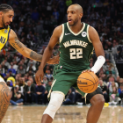
10. Milwaukee Bucks
Taking inspiration from the Great Lakes in the midwest, the Bucks went full blue man group with these uniforms, and it looks really clean. I didn't think combining three shades of blue on the same jersey would look aesthetically pleasing, but Milwaukee pulled it off.
Blue(s).
— Milwaukee Bucks (@Bucks) December 1, 2020
Inspired by Milwaukee’s meaning as “the gathering place by the water,” introducing the 2020-21 City Edition uniform.https://t.co/j5BaEDFYp0 pic.twitter.com/lJ27gYuYQI
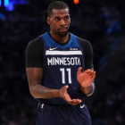
9. Minnesota Timberwolves
You may not think that these deserve to be in the Top 10, but the simplicity of these uniforms and the subtle flashes of color and the North Star adorned in several places throughout the jerseys are amazing. The Wolves have had a great streak of success with their city edition jerseys, and they've nailed it again this year with this sleek, simple design.
❇️ 𝙏𝙝𝙚 𝙉𝙤𝙧𝙩𝙝 𝙎𝙩𝙖𝙧 𝘾𝙞𝙩𝙮 𝙀𝙙𝙞𝙩𝙞𝙤𝙣 ❇️
— Minnesota Timberwolves (@Timberwolves) December 3, 2020
🎵 @doitlikedua pic.twitter.com/gRemxMljAg
8. Atlanta Hawks
In an unprecedented move, the Hawks partnered with the estate of Dr. Martin Luther King Jr. to release an MLK-inspired jersey, complete with a new court design for the occasion. The understated design speaks to the impact Dr. King had in his fight for racial equality during his life. Atlanta executed this jersey design perfectly and didn't overcrowd it to let the message ring through.
That Black, Gold and White is just 🔥
— Atlanta Hawks (@ATLHawks) November 28, 2020
Sign up for all pre-order updates for the 20-21 MLK Nike City Edition Jersey 👉 https://t.co/htQOqISOJQ#EarnTheseLetters pic.twitter.com/U3DNQd4OX9
7. Charlotte Hornets
The Hornets benefit from having perhaps the best color palette of any team in the league, so almost any design would look great in their patented teal and purple. For this season's 'City' edition jersey, though, Charlotte flipped the script and introduced a new color to their repertoire using mint as the primary color, with gold and black accents. The Hornets are calling it "Buzz City Minted" and they also incorporated their signature pinstripe that has made their retro jerseys some of the most popular in the league. Charlotte nailed it with these, and it should be interesting to see if these look just as great on the court as they do on.
MINTY FRESH. 🥶 pic.twitter.com/WmtDvJmzwD
— Charlotte Hornets (@hornets) November 12, 2020
6. Golden State Warriors
It was a smart marketing move by the Warriors to put "Oakland" on their jerseys shortly after bolting the city for San Francisco. They also played on the nostalgia vibes by essentially recreating the "We Believe" Warriors uniform with some subtle changes, like swapping out "Warriors" across the chest for Oakland. This may not sit well with all Golden State fans considering the team's recent move from the blue-collar city of Oakland for the tech capital of the country San Francisco, but the execution of the jersey design is perfect. Plus, the navy blue, gold and orange just work really well together here, and gives the old jersey a refreshed update.
Oakland is and will always be a part of our team’s identity.
— Golden State Warriors (@warriors) November 2, 2020
“Oakland Forever," presented by @Rakuten, is a nod to the We Believe era and its turning point in Oakland’s basketball history.
To honor the Town, we partnered with Nike to put a spin on these classic uniforms. pic.twitter.com/d7nUAJLbzM
5. Indiana Pacers
There's been a lot of pinstripe jerseys this year, but the Pacers version stands above the rest. For the first time since 2006, the Pacers are finally wearing pinstripes again, and man did we miss these. Popularized by the team wearing them in the 2000 NBA Finals, and most notably Reggie Miller, these are without a doubt the best jerseys Indiana has ever worn.
These are more than pinstripes. They are a symbol of who we are and what we represent.
— Indiana Pacers (@Pacers) December 1, 2020
There is #PowerINPinstripes.https://t.co/c1uqbVoVd9 pic.twitter.com/eGMLEPXjTd
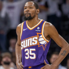
4. Phoenix Suns
The Suns made some huge splashes on the court by trading for Chris Paul and signing a slew of free agents that will make them a serious playoff contender this season, and they also released one of the best 'City' edition jerseys in the league. For years, Phoenix has churned out uninspiring city jerseys, but this time around they took a bold swing and knocked it out of the park. Playing on Phoenix's nickname of "Valley of the Sun," in addition to a pixelated design of the beautiful Phoenix sunsets, this jersey is incredibly innovative. Similar to the Hornets, the Suns have one of the best color palettes in the league, and they finally made the best use of purple and orange to create a stylish modern jersey.
Phoenix Suns Debut Valley City Edition Uniform pic.twitter.com/UrTEEZji9F
— Marc J. Spears (@MarcJSpears) November 12, 2020
3. Brooklyn Nets
At first look, I wasn't a fan of the Jean-Michel Basquiat jerseys, but after giving it a day, looking closer at the details, this uniform is a hit for me. The paint strokes on the side panels, the herringbone black pattern throughout the uniform and the crown motif which Basquiat used frequently in his artwork all pull this jersey together. It's different and unique from any other jersey but still remains clean. More importantly, the Nets are the only team in the league that continuously uses its 'City' edition to actually pay homage to those from Brooklyn. First, it was Biggie Smalls, now innovative artist Basquiat.
Celebrate the 𝒶𝓇𝓉𝒾𝓈𝓉𝓈 who move us forward.
— Brooklyn Nets (@BrooklynNets) December 3, 2020
Introducing our 2020-21 City Edition uniform inspired by Brooklyn-born Jean-Michel Basquiat 🎨 pic.twitter.com/ptIWGHcSc6
2. San Antonio Spurs
Yes, yes, yes. The Spurs gave the fans what they wanted after years of camo city jerseys. San Antonio never actually wore fiesta-themed jerseys, but wore warm-ups with this design back in the '90s. Now, the Spurs have taken the exciting color scheme and turned it into a full uniform and it looks amazing.
Old School. New Style. Authentic Heritage.
— San Antonio Spurs (@spurs) November 13, 2020
Introducing #SpursFiesta—our 𝟐𝟎𝟐𝟎-𝟐𝟏 𝐂𝐢𝐭𝐲 𝐄𝐝𝐢𝐭𝐢𝐨𝐧 𝐔𝐧𝐢𝐟𝐨𝐫𝐦. @HEB | #GoSpursGo pic.twitter.com/1rHVaL2jgi
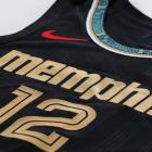
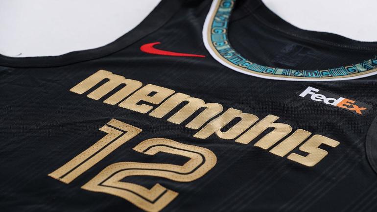
These are the best in the league, and it's not even close. The black, the gold lettering, the teal and gold design accents on the side paneling. The Grizzlies are paying homage to the history of soul music in the city of Memphis as well as the legacy of Stax Records singer/songwriter Isaac Hayes with these jerseys, and they turned out beautifully.
shut your mouth 😎🙅♂️ pic.twitter.com/ooMHkZu4dq
— Memphis Grizzlies (@memgrizz) November 24, 2020