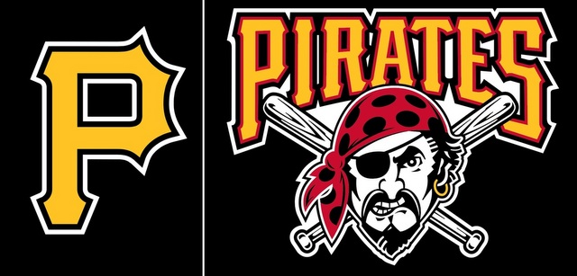
The Pirates will have a slightly new look in 2014. The team announced it has adopted the gold "P" as its primary logo, replacing the classic Jolly Roger design. The gold "P" had essentially taken over the team's go-to logo in recent years, but now it is official. Here are the two designs side-by-side:

Do not fret, Pirates purists, the Jolly Roger design is not disappearing forever. The logo will remain as "miscellaneous art" and continue to appear on the team's uniform. Michael Sanserino of the Pittsburgh Post-Gazette says the team originally explored a logo change but decided to stick with the gold "P" due to fan feedback.
In other uniform news: the Pirates are also changing their batting practice jerseys from solid yellow to solid black. The numbers and letters will be black with a gold outline, which sounds pretty sweet. I've always thought the Buccos had one of the sharpest color schemes in the game.
![[object Object] Logo](https://sportshub.cbsistatic.com/i/2020/04/22/e9ceb731-8b3f-4c60-98fe-090ab66a2997/screen-shot-2020-04-22-at-11-04-56-am.png)


