


The NBA apparently saw the widely-derided 2018 NFL Draft hats and said "hold my beer." New Era on Tuesday unveiled the caps that NBA draftees will be wearing on June 21 at Barclays Center in Brooklyn and the hats are amazing ... for future employees of Chotchkie's.
2018 NBA Authentics: Draft Series @Suns cap is here https://t.co/XeBm7Mia3j pic.twitter.com/CPpQWMIxZI
— New Era Cap (@NewEraCap) June 5, 2018
For future NBA stars? Well, we'll always have some fun photos years from now remembering the time that the NBA thought it would be a good idea to bust out the flair for its big draft party. You can see what the NBA was going for with the style, but it just didn't really translate. You obviously want players to be happy with where they're going, and this is a way to personalize each team.
The NFL went for something similar. The problem is, having a bunch of patches and pins on hats looks a tad silly. Some of them look kind of cool, but it's just so busy. There are commonalities: Each features the team crest, the year the team was founded or moved, alternate logo and state flag. The difference is in the pins.
So, without further ado, here are the best and worst hats from New Era. Hat tip to Jeff Eisenband on Twitter for curating all of these hat photos.
Five worst
5. NBA
This is the generic @NBA hat. I hope Adam Silver wears this on the podium. #NBADraft pic.twitter.com/hvXYbhVNi2
— Jeff Eisenband (@JeffEisenband) June 5, 2018
I just hate the basketball pin so much. This looks like a collage someone did when they were asked what they think about when they think of the NBA. Even with all of that stuff, it still manages to look boring.
 4. Denver Nuggets
#MileHigh caps at No. 14. @nuggets (note the colors) pic.twitter.com/8uTSKVHbMY
— Jeff Eisenband (@JeffEisenband) June 5, 2018
Kind of botching the reveal here aren't you? The Mile High pin is unimaginative when you live in an area with the scenery of Denver, and why would you want your color scheme to be revealed via what amounts to a leak? The new logo scheme is fine, but we'll have to wait for the jerseys to see how it translates to the court.
 3. Detroit Pistons
The @DetroitPistons will finally pick at No. 42 with this cap. #MotorCity pic.twitter.com/7e8umYff7U
— Jeff Eisenband (@JeffEisenband) June 5, 2018
Much like I didn't like the Pistons' city jerseys for the "Motor City" chest, I don't like the pin. There's a lot you can do, heck, just have a car if you want to lean into the name. Going with the wording just seems so boring.
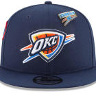
 2. Oklahoma City Thunder
.@okcthunder going with #ThunderUp.
— Jeff Eisenband (@JeffEisenband) June 5, 2018
Real fans remember @KDthunderup. pic.twitter.com/zwUg4ohY7R
OK. You got me, I hate teams that have moved cities not paying homage to their roots. On this one, I mostly hate the pin, because it's just a repurposing of the original logo. If you need flair, have flair. The real bias showing through here is a dislike of "[x] up."
 1. Memphis Grizzlies
Shoutout #GrindCity.
— Jeff Eisenband (@JeffEisenband) June 5, 2018
Note the '01. That's the move to Memphis. @memgrizz pic.twitter.com/rO6B5bXnwh
I do like the '01 patch, it's a cool little tribute, but the Grit and Grind Grizzlies are done. This would have been fine as a patch -- Tony Allen and Zach Randolph deserve recognition for the era of basketball they ushered into Memphis -- but you're looking to rebuild, not relive. This is a sad reminder that the Grizzlies tanked themselves into oblivion last year after seven straight playoff appearances. Trying to recapture that just a season later is kind of depressing. Also, no tribute to Vancouver anywhere? Come on.
Five best
 5. Philadelphia 76ers
That pin should say "#TrustTheProcess," but a Liberty Bell and a Ben Franklin patch work for the @sixers. pic.twitter.com/yVmzwlfp72
— Jeff Eisenband (@JeffEisenband) June 5, 2018
First of all, the Liberty Bell pin is really cool, simplistic, and it's synonymous with Philadelphia. I love the look. But as much as I love minimalist logos, LOOK AT THAT BALLIN' BENJAMIN FRANKLIN PATCH. Hoopin' Ben Franklin is amazing, and I'm starting a petition to make that the Sixers' primary logo.
 4. Boston Celtics
Whatever magic Danny Ainge pulls at No. 27 will reward a draftee with this @celtics cap. 🍀 pic.twitter.com/NHDijpEOHj
— Jeff Eisenband (@JeffEisenband) June 5, 2018
People can hate the Celtics all they want and I'll never take that away from them, but the shamrock is such a cool logo that I I even love it as a pin. They didn't do too much with one of the NBA's most iconic franchises, and I respect that.
 3. Toronto Raptors
The @Raptors also have no pick, but they did put out a cap. And instead of a city or state, they just put the national flag on their hat. 🇨🇦🍁 #WeTheNorth pic.twitter.com/iyHkD1yXYk
— Jeff Eisenband (@JeffEisenband) June 5, 2018
I love how the Raptors represent their country, and this hat only solidifies that. The only thing it's missing is a patch of LeBron's face.
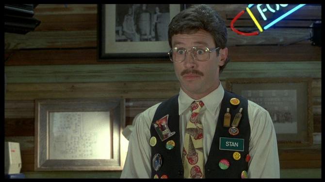
 2. Los Angeles Lakers
.@Lakers have to wait until No. 25...check the sunglasses. #LakeShow pic.twitter.com/TE7bDGlVrI
— Jeff Eisenband (@JeffEisenband) June 5, 2018
I kind of have a special deference for this one, because in my head it was inspired by this guy:
 1. Portland Trail Blazers
Instantly the most hipster hat on the market. @trailblazers pic.twitter.com/NT9MOZTmpY
— Jeff Eisenband (@JeffEisenband) June 5, 2018
Anything that reminds me of the Moda Center's ONE TRUE NAME deserves recognition. Branding be damned, it's the Rose Garden forever.