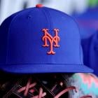
MLB teams have been releasing the newest edition of their City Connect uniforms lately, and the Mets joined that trend on Friday. Using a gray, purple and black color scheme, the Mets tried to honor their home city with their new threads.
The Mets' traditional orange and blue colors are some of the most iconic in baseball, but they are ditching those in hopes of representing the aesthetic of The Big Apple. With their new City Connect uniforms, the Mets chose gray to represent the concrete jungle and purple for the 7 Line, which runs to Citi Field.
The Mets City Connect uniforms are HERE! 👀
— MLB (@MLB) April 19, 2024
Honoring everything that makes NYC the World's City. If you know NY, you know pic.twitter.com/Tw3HKX5K9u
Mets chief marketing officer Andy Goldberg said the team wanted to bring together fans from all across the city -- and the globe -- with this new look.
"It's all about connecting to New York," Goldberg said, via MLB.com. "A lot of detail, a lot of focus on this idea that yeah, it's not orange and blue by design. It's meant to connect to New York. It's meant to not just be an alternate Mets uniform. It's our City Connect. It is how Met fans can represent across the world."
Smaller details on the uniform include the circles and diamonds that make up the pinstripes, meant to represent the different subway lines in the city. The sleeve patch takes on the look of a New York City subway token, the cap bears an image of the Queensboro Bridge and there is an "artistic interpretation" of a subway map inside the hat.